For years, the Best Buy Partner Portal was a fragmented collection of policies, brand guidelines, and legacy tools that felt… to put it lightly… stuck in 2014. I led the structural redesign as the sole product designer, transforming it into a responsive, template-driven system that finally aligned with Best Buy’s 2024 brand evolution.
Annual PageViews
Enterprise Users
Pieces of Content Modernized
Reduction in Unique Layouts
Client
Best Buy
Role
Solo Product Designer
Timeline
September 2024 - January 2025


Problem Space
A Legacy of "Good Enough"
As Best Buy’s brand identity moved toward a sleek, modern aesthetic, the Partner Portal stayed behind. It was a classic case of a critical tool suffering from legacy drift. The experience was:
Visually Outdated
It didn't look like a Best Buy product, which created a trust gap for high-value partners.
Desktop-Locked
Most of the portal was unusable for partners in the field who needed to access brand guidelines or shipping policies on their phones.
A Maintenance Burden
Because there was no underlying template system or design governance, the portal became a content free-for-all. Without guardrails, every new update required a unique, hand-built page. This was not only inconsistent for the user—it was a nightmare for the admins to maintain.
Research
Auditing the Content Architecture
Before I touched a single pixel, I had to understand the scale of the content debt we were inherited.
The Structural Audit
To scale the portal effectively, I spent the first two weeks auditing the existing content to identify truly unique page types. My goal was to move away from hand-built, one-off layouts and toward a templatized system that could handle any content needs.
Through this audit, I identified five core page archetypes that represented the entire portal's ecosystem:
Home: The high-level site landing page and primary entry point.
Geography: Regional views, such as Best Buy US versus Best Buy Canada.
Partner Types: Audience-specific hubs, including US Merchandising and Carriers.
Departments: Functional areas like Finance and Accounting or Brand and Display Standards.
Content: The atomic level of the site, such as a specific policy or guideline.
By grouping hundreds of fragmented pages into these five categories, I was able to define the underlying logic for a modular design system. This categorization ensured that regardless of the specific content, every page now followed a consistent, predictable hierarchy.
Admin Discovery & Feedback Loops
To understand the friction behind the scenes, I established weekly discovery sessions with the portal admins. My goal was to move beyond what they wanted and uncover the functional pain points of their daily workflow.
These interviews revealed three core requirements:
Governance over Customization: Admins were tired of hand-building every page. They needed a system that made the correct design choice the easiest one to implement.
Component Versatility: They required a toolkit flexible enough to handle various content types—from legal PDFs to image galleries—without breaking the layout.
Mobile Parity: They needed the confidence that whatever they built on a desktop would be immediately legible for partners using tablets or phones in the field.
Design Process
Systems-Led Design
Modernizing the portal required a balance between strict brand adherence and functional utility. As the sole designer on this initiative, I was responsible for ensuring every component met the high bar of Best Buy’s 2024 brand evolution while remaining practical for enterprise use.
Aligning with the Brand Refresh
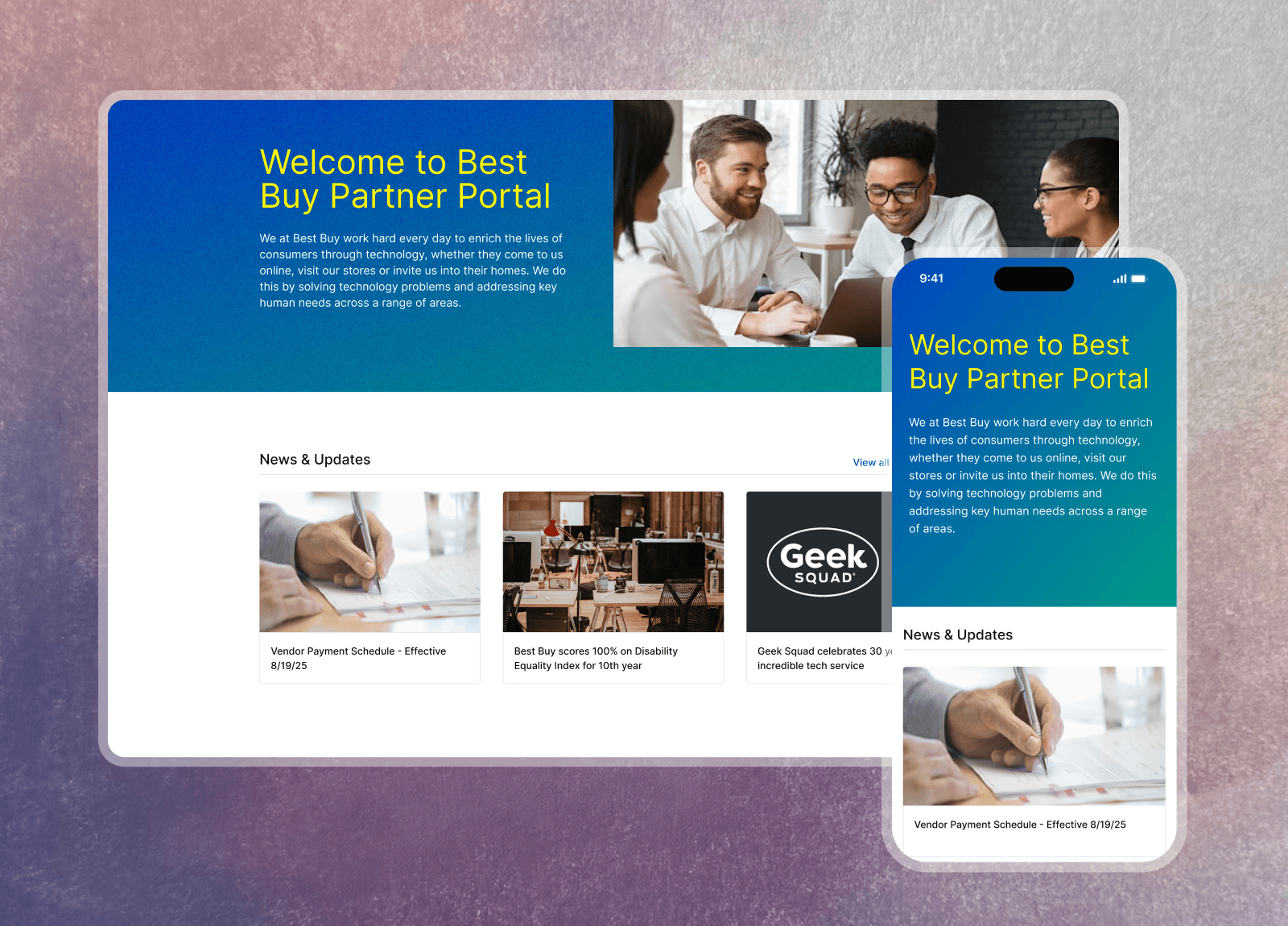
The visual direction was dictated by Best Buy’s 2024 brand refresh, which introduced a more vibrant, tech-forward aesthetic. Working within these defined constraints, I translated the new brand DNA into a digital-first environment. This meant moving away from the heavy, legacy UI of the past and toward a cleaner, high-contrast system that felt both modern and accessible to our 3,000+ partners.

Maintaining Standards through Collaboration
While I led the project independently, I did not work in a vacuum. To ensure the new portal patterns remained consistent with the broader Best Buy ecosystem, I presented my updates at weekly design critiques. These sessions allowed me to collaborate with the core design team, stress-testing my components against established standards and ensuring that the partner experience felt like a seamless extension of the customer-facing brand.


Final Delivery
A Modular System for Future Growth
The final output was more than a redesign; it was a comprehensive UI kit designed to scale. By moving away from fixed page layouts and toward a component-based architecture, I provided the portal admins with a flexible, durable toolkit.
The Partner Component Library
I designed 12 core responsive components that could be combined to build any of the five page archetypes identified during research. These weren't just visual elements—they were functional blocks built to handle high-density information while remaining accessible on mobile devices.
Responsive by Default
A critical requirement was ensuring 3,000+ partners could access the portal on the go. Every component was stress-tested across screen sizes, ensuring that brand guidelines and operational policies were as legible on a smartphone as they were on a 27-inch monitor.

Results
Scaling with Confidence
With the new system in place, we successfully modernized 15 high-traffic pages, aligning the partner experience with Best Buy’s 2024 brand vision. By providing these guardrails, we effectively eliminated the need for hand-built pages, reducing the time required for content updates and ensuring long-term design consistency.
Annual PageViews
Enterprise Users
Pieces of Content Modernized
Reduction in Unique Layouts
What I Learned
Design governance is a form of empathy.
Providing the admins with a modular toolkit wasn't just about brand consistency; it was about respecting their time. I learned that by building strict guardrails into the system, I could empower the team to create high-quality pages without the stress of manual design. When the "right" choice is the easiest choice, everyone wins.
Constraints drive cleaner architecture.
Working within the strict 2024 brand guidelines forced me to be more intentional with my UI decisions. Instead of trying to reinvent the wheel, I focused on how to make the existing brand DNA work harder for complex, data-heavy partner tools. Strong constraints actually accelerated the transition from fragmented pages to a unified system.
Success in a solo role requires active collaboration.
Even as the sole designer, I learned that my best work happened when I stepped out of the "silo." By establishing weekly feedback loops with admins and presenting at design crits, I ensured the portal didn't just work in a vacuum—it remained aligned with the broader Best Buy ecosystem and the people who use it every day.
Credits
Design
Uvie Adah –– Product Designer
Engineering
Louie Fallaria –– Engineering Assoc. Manager
Kenneth Aquino –– Sr. Software Engineer
Product
Kate Pangandaman –– Sr. Product Manager
Sara Halfmann –– Sr. Business Manager

